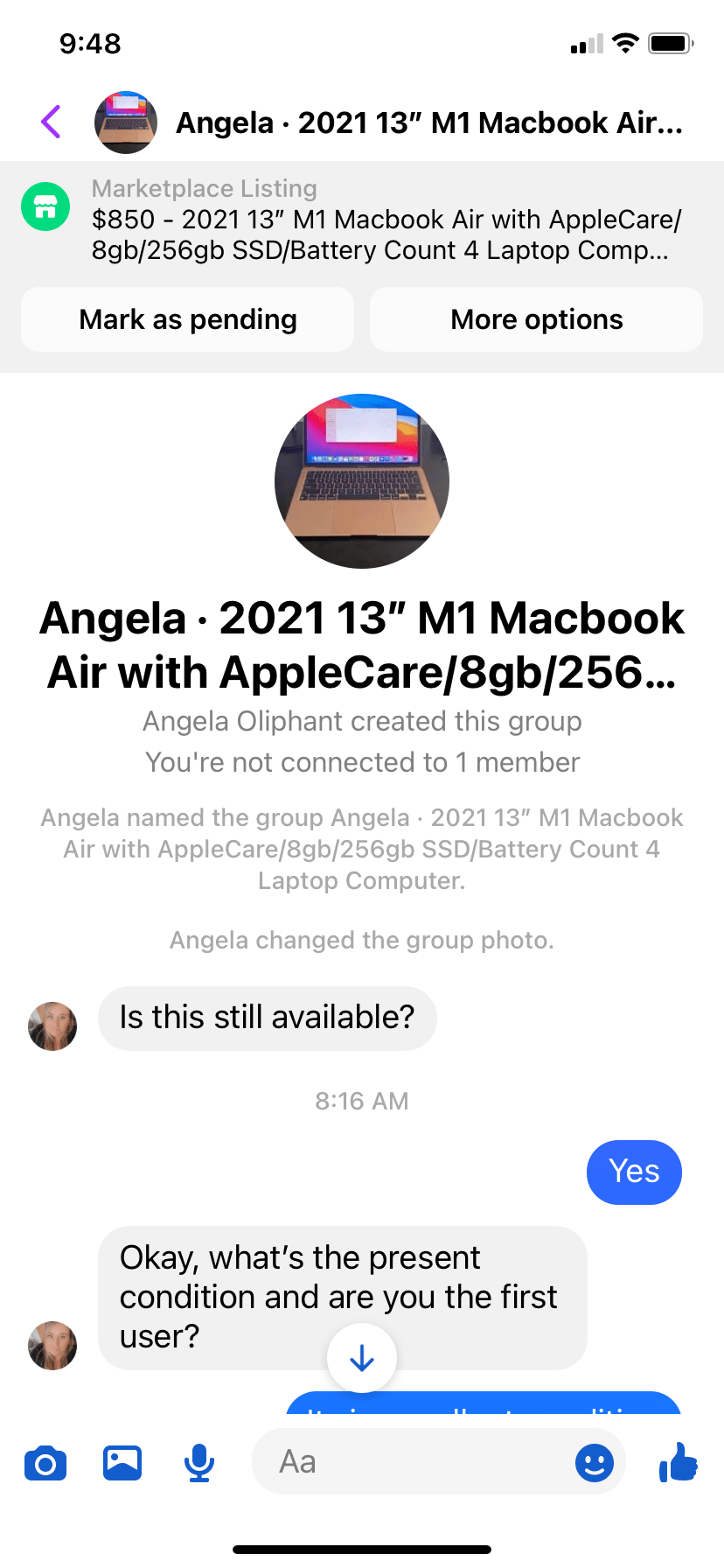
If you've asked anybody who's tried to sell anything on Facebook Marketplace, Offerup or Craigslist, I can guarantee you that every one of them have encountered somebody trying to scam them. I've encountered quite a few but I'll explain how this particular scam works and how bad UI contributes to scammers being successful.
I recently posted a laptop for sale on Facebook Marketplace and immediately got a somebody interested. I know it's a scam right away because of the language they use. They never say they're interested in the Macbook or laptop or computer. They always say things like "what's the present condition of the item", "what's the final asking price", and "i will pay you to ship it."
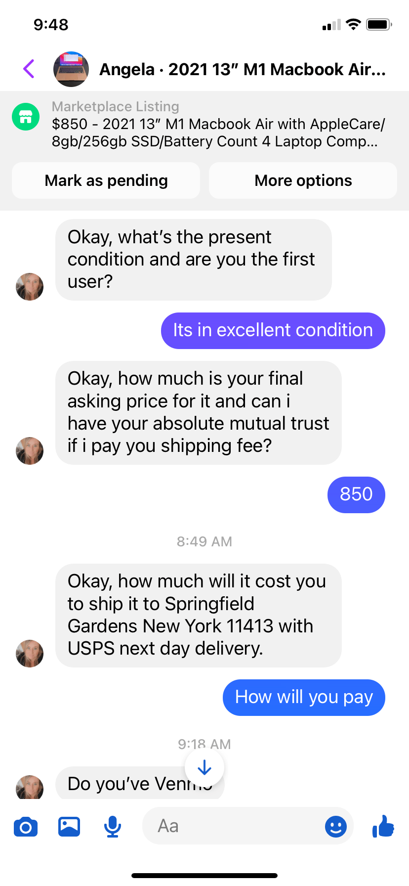
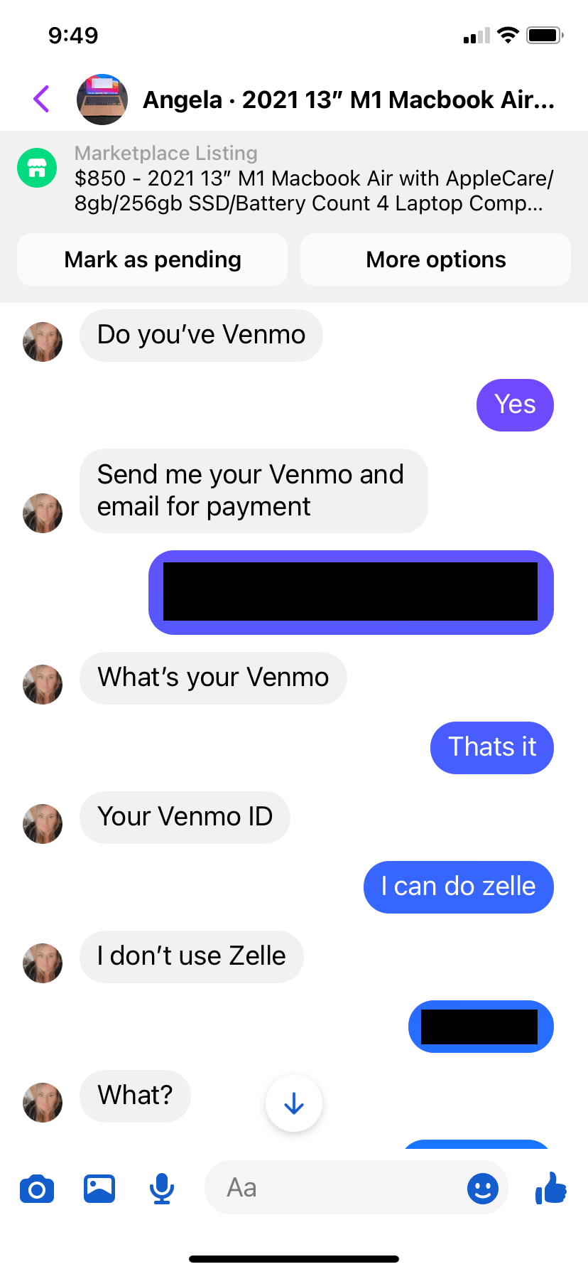
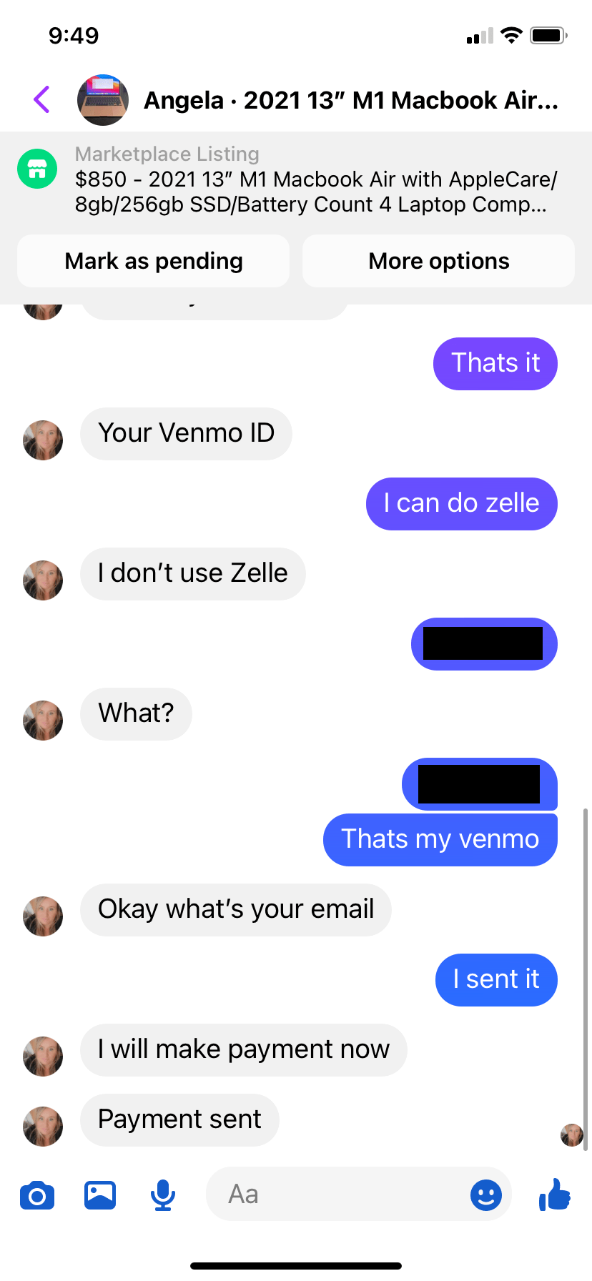
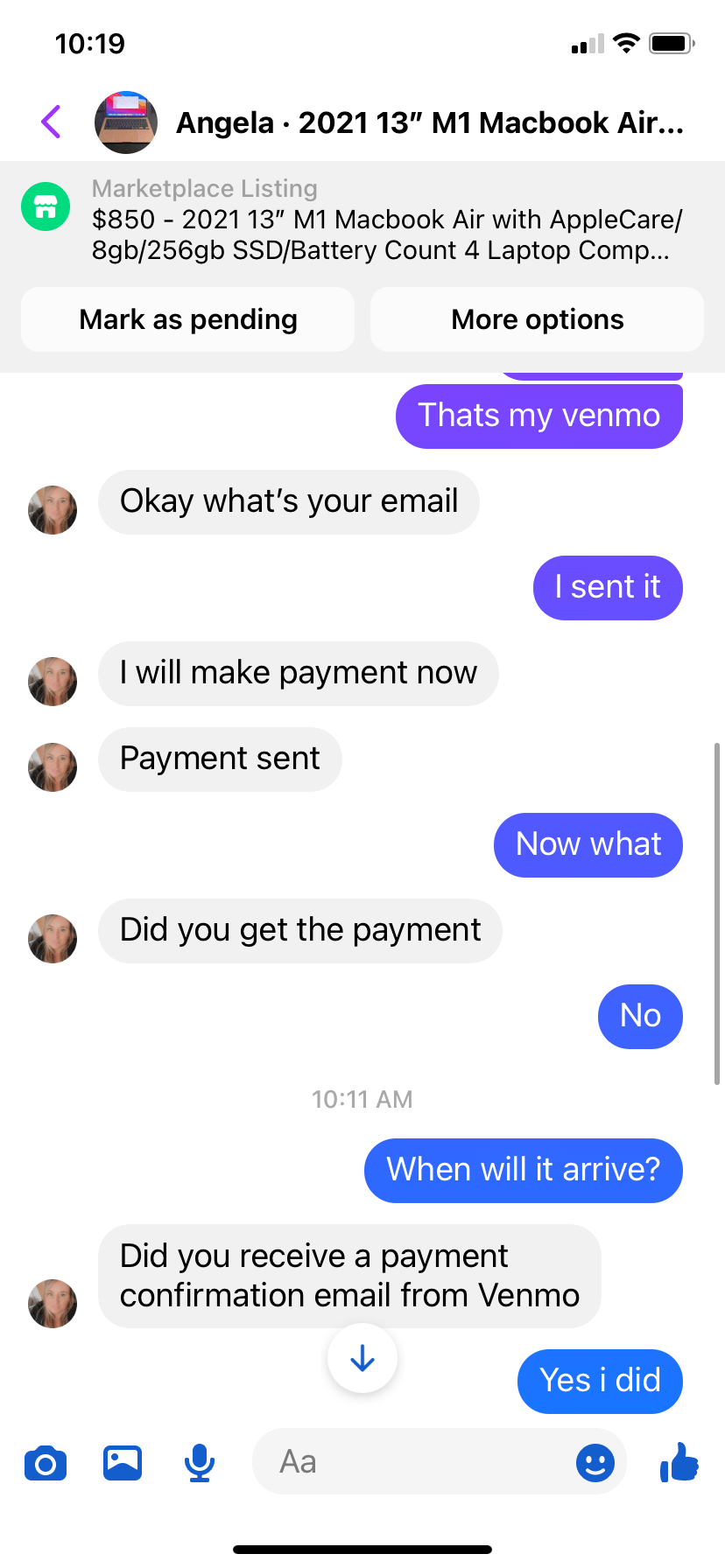
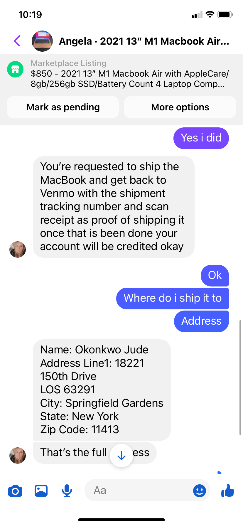
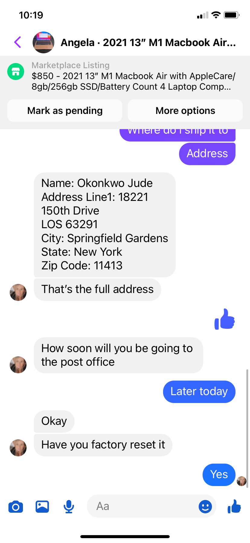
Usually I will blow them off but when I'm bored I'll continue the conversation. The usual scam I've encountered involves Zelle (I'll blog about this in another article) but this one in particular involves Venmo. After a few back and forwards, he agrees to send the full amount with a shipping fee via Venmo if I send it next day USPS.
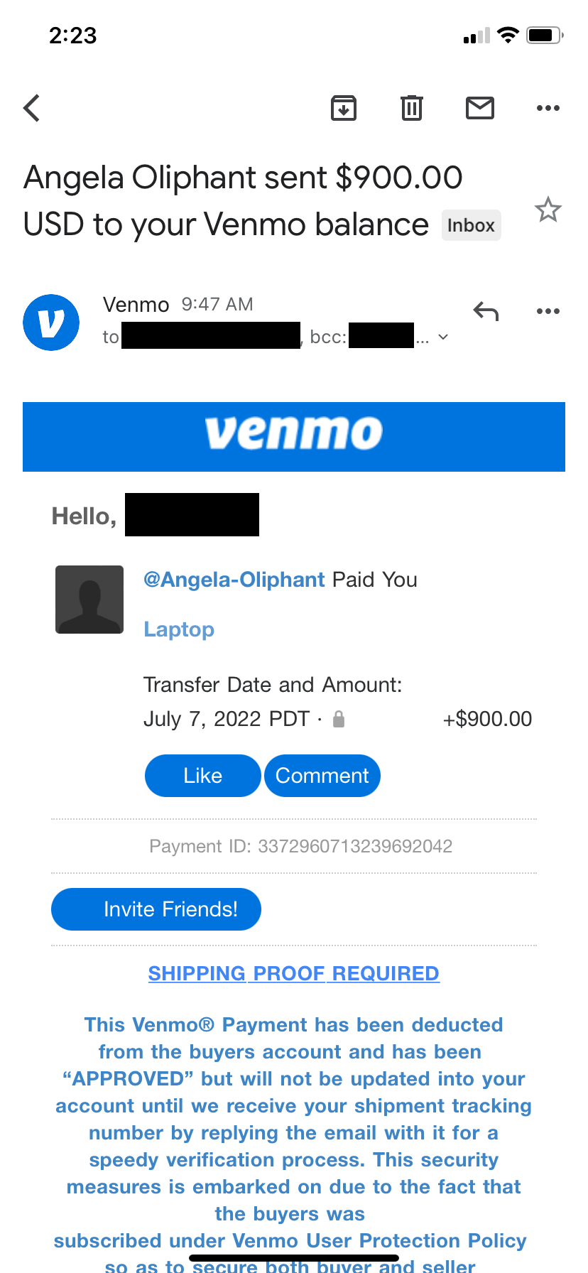
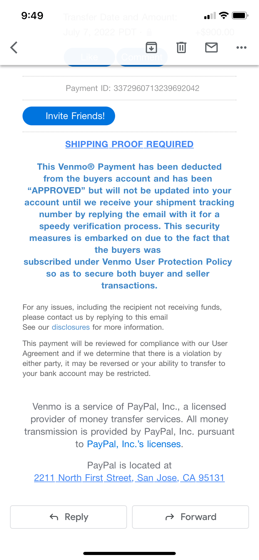
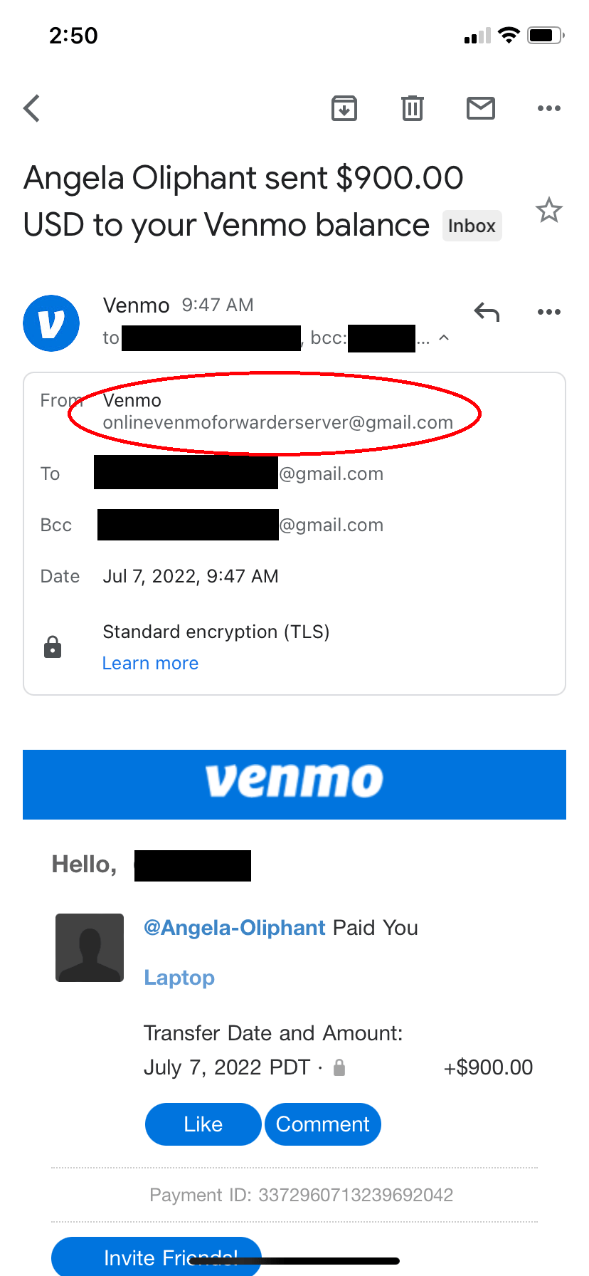
He sends the "payment" and asks me to check my email. I receive as an email from "Venmo." This is where bad UI design is causing people to get scammed. The email appears to be legit with the Venmo colors and wording. If you aren't tech savvy, you will only see it coming from "Venmo." You have to click and expand it to show the email address is onlinevenmoforwarderserver@gmail.com. Gmail by default hides the sender email address (but conveniently shows the recipient email address??). I'm sure many people mostly use their phones to email and don't know how to expand to display the full email address.
If I was an unsuspecting victim and followed through with the email, I may have sent my laptop to this person thinking Venmo will fund my account once I produced a tracking number. Once I realized my account isn't funded, I would probably contact Venmo who will tell me that they never sent any email to me. Then I would become another statistic.
This Gmail "feature" is one example of what I consider bad UI (either via discovery problems or plain bad UI). When the iPhone first came out, it was very user friendly and non-techies in my friend had no problem using it. As iOS added more and more "features", all these came more hidden or had to find. Try explaining to your grandma how to unlock the orientation lock on their iPhone over the phone. Was it swipe down on upper right corner of the screen or upper left corner? Maybe swipe up from the bottom? Wait, which version of the iPhone is it?.